Rand Thompson Consultants
An executive search firm in New York, founded in 1982, with one page on a website builder. No navigation, no roles, no people, no way to book a conversation. In a business where the first impression is the whole pitch, the website was saying almost nothing. So we built the firm a brand, a site, and the systems behind it.
One page. Then forty-five.
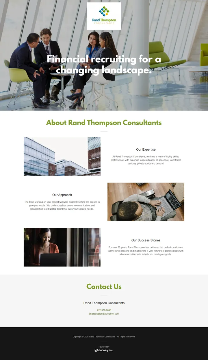
The entire site. 2,489 pixels tall at desktop width.

The homepage alone. 7,458 pixels. Forty-four more pages behind it.
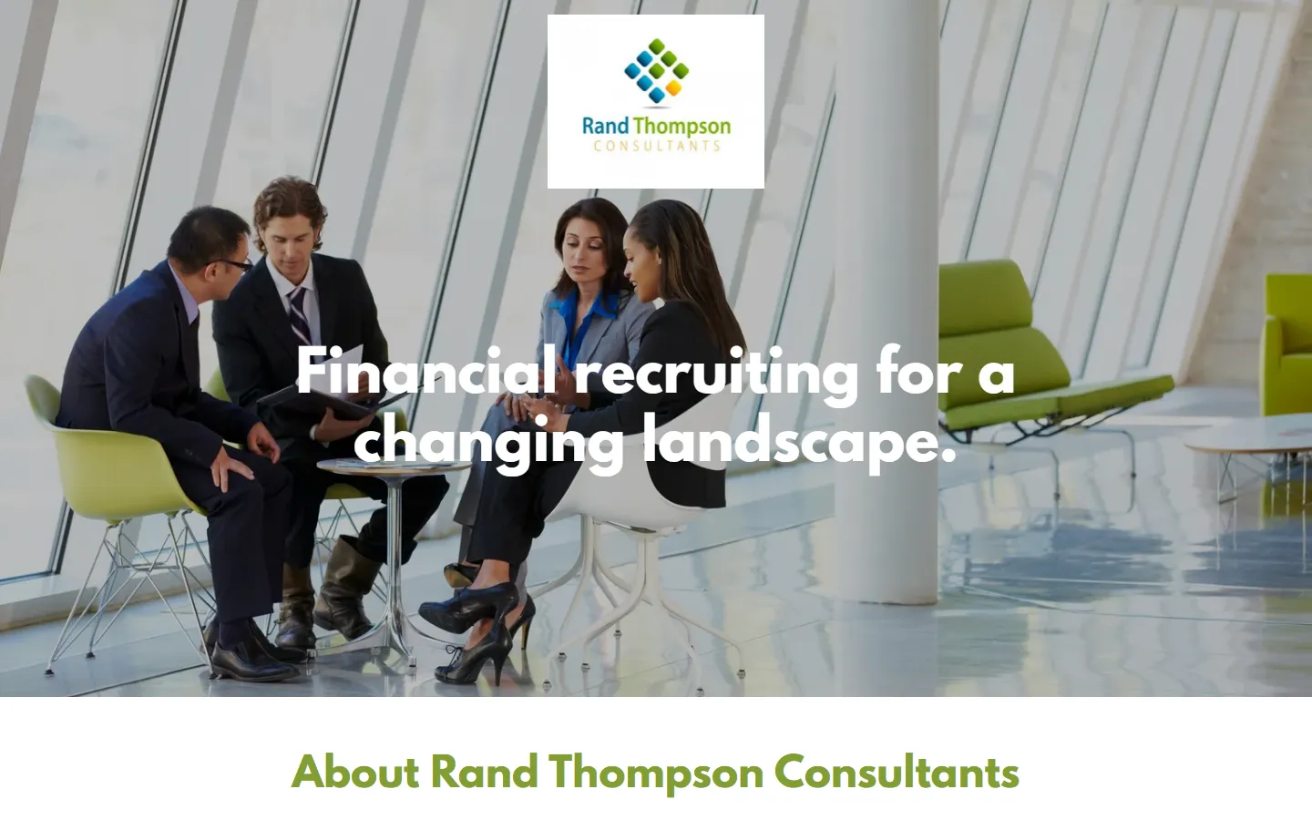
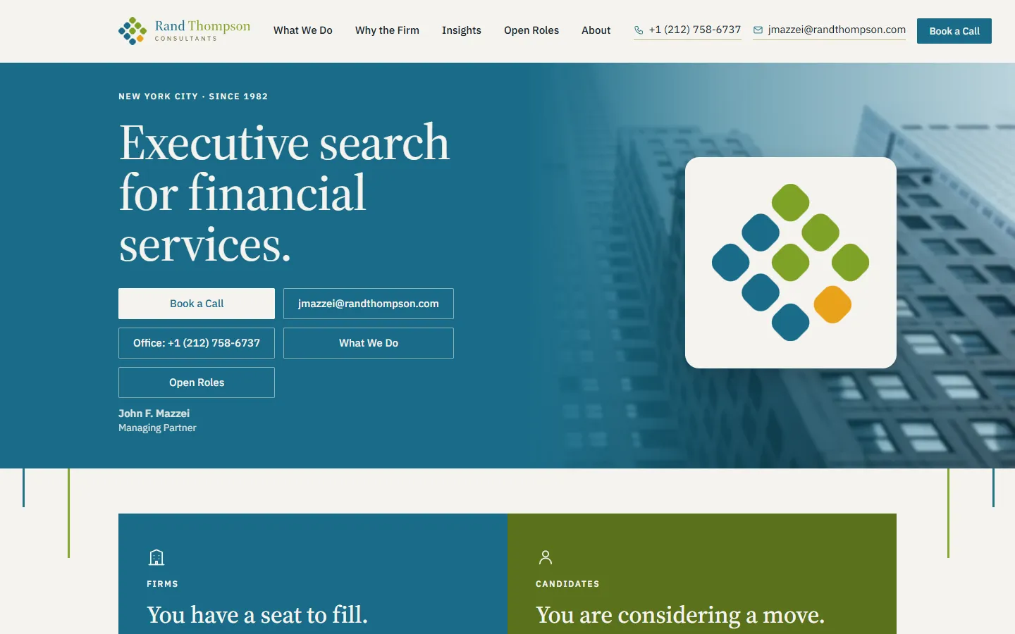 BeforeAfter
The first screen a visitor sees, desktop. Drag.
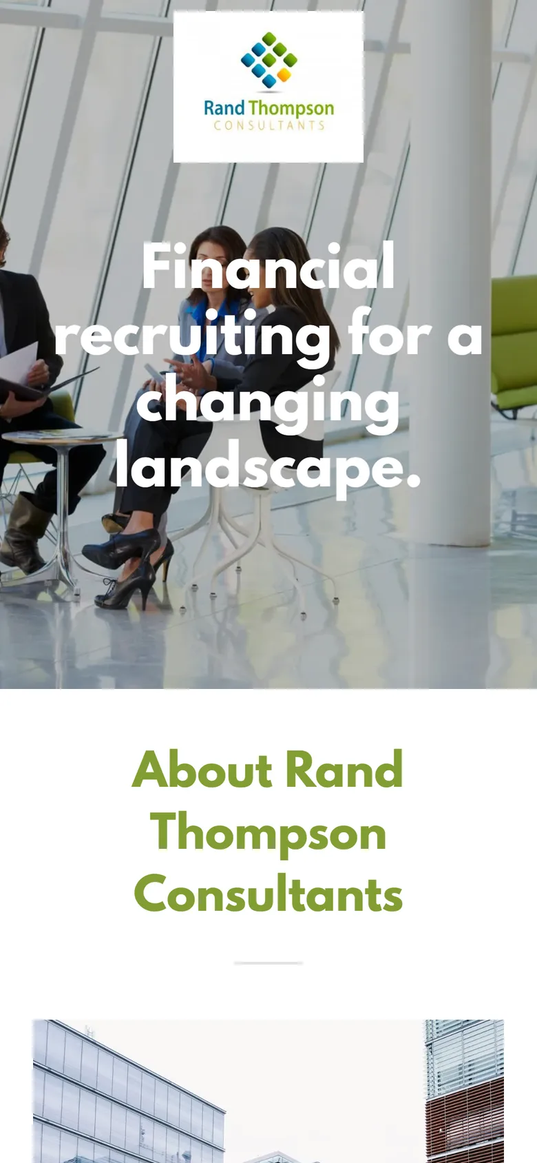
Before, phone
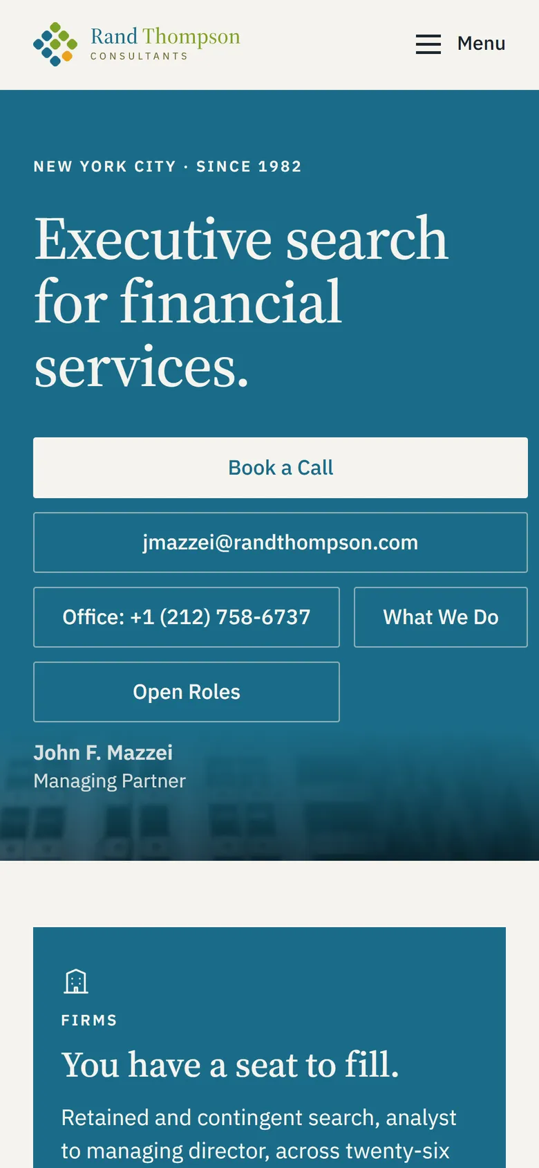
After, phone
- Pages
1→45- Accessibility
87→100- Best practices
96→100- Search readiness
83→100- Performance
95→97
Google's Lighthouse audit, mobile. Before: the old randthompson.com, measured 4 October 2026, the day before the switch. After: randthompson.com, measured 6 October 2026. Performance is the median of three runs; the new homepage carries the whole firm and still holds the score.
The walkthrough, sixty-eight seconds: the old page, the new site, the areas, the phones, and what runs behind it.
The brief
Rand Thompson Consultants has placed people in financial services since 1982. The website had not kept up. One page, a stock photograph, three paragraphs of centered grey text, and a phone number. No navigation because there was nowhere to go. No open roles. Nobody from the firm. No way to start a conversation except an email address.
For a firm whose work is judged on the first conversation, the site was the first conversation, and it was not saying anything. The brief was the whole thing: the identity, the site, and the systems that turn a visitor into a conversation with the right person.
The brand
Before the site there had to be something to build it from. The firm had a logo and no system behind it.
- The mark. Nine squares set on the diagonal, one of them gold. It reads as a grid of people and as a single thing at once, and it is the firm’s most recognizable asset now.
- Type and color. A serif for the display, a sans for everything else, on a paper ground with the firm’s blue, green, gold, and tan. Chosen to look like a firm that has been here forty years and intends to stay.
- Seventeen logo lockups. Horizontal, stacked, mark alone, wordmark alone, on paper, on ink, on blue. So the right one exists for every surface instead of a stretched version of the wrong one.
- Templates for every surface. LinkedIn posts, document covers, job posts, the company banner, the avatar, the favicons, and print. One system, so a role post and a letterhead look like they came from the same building.
The website
- Two front doors. Firms with a seat to fill and candidates considering a move land on the same page and are sent the right way in one click.
- Twenty-six practice areas, each with a page. People do not search for a recruiter. They search for a recruiter in their specialty. Now each one has somewhere to land.
- The team, the searches, the insights. Who the firm is, what it is working on, and a place for the Managing Partner’s own view on the market, one sector at a time.
- Built for the phone, too. Forty-five pages that hold their shape on a screen the width of a hand, with the email and the office line one tap each.
- Accessibility, 87 to 100. Real text, headings in order, everything reachable by keyboard, color that passes.
Booking and lead infrastructure
The site is not a brochure. Every enquiry it takes goes somewhere useful.
- Calendarization implementation. A calendar per consultant, synced to their own. Book a Call on every page. Confirmations and reminders go out on their own.
- Three kinds of enquiry, routed. An institution with a seat to fill, a candidate, or someone registering interest in a role. Each one is filed, tagged, and sent to the right person with the message intact.
- The source on every enquiry. Each alert says how the person found the firm and what they landed on. “Found the site via LinkedIn, landed on a practice area page.” That is the difference between marketing you can read and marketing you guess at.
- Spam and noise handled before anyone at the firm sees it.
Marketing
A firm with a Managing Partner who has spent forty years in the market has a lot to say. The program is built to say it in his voice, on the channel his clients actually read.
- LinkedIn, as a cold outreach strategy. The company page, built and branded. A template for every open search so each role goes out looking like the firm. One sector note a month from the Managing Partner, linking back to its practice area.
- Video and imagery. A launch film and a walkthrough, both on the brand, both built from the live site. Photography chosen so twenty-six practice areas each look like what they are.
- The network, organized. Twenty-two thousand connections, being turned into a list the firm can actually work: sorted, segmented, ready for the first note.
Found and measured
- The Google listing, claimed and corrected. The firm’s profile existed at an address it left years ago. It is the firm’s now, with the right name, the right number, and the right description.
- Found on Google, Bing, and by AI assistants. Every page structured so it can be read, indexed, and quoted. Search readiness scored 100 on launch.
- Measurement from day one. Analytics with a lead event on every call, email, booking, and role view, fourteen months of history kept, Search Console linked. The first monthly report will say which practice areas are pulling and what people typed to get there.
Where it stands
randthompson.com went live on 4 October 2026. There is nothing yet to report on enquiries, and we are not going to invent any. What is true today is that a firm founded in 1982 has, for the first time, a website that says who it is, a page for every specialty it recruits in, a way for the right person to book a conversation at eleven at night, and a system that tells the Managing Partner where every one of them came from.
The first report lands in November.
Don’t get left behind.
A missed call turns into someone else’s customer. One call, plain answers, and you see the plan before you commit.